ARCHIVES
(2017-2023)
CONTEXT - Projects completed between 2017-2023 for various clients
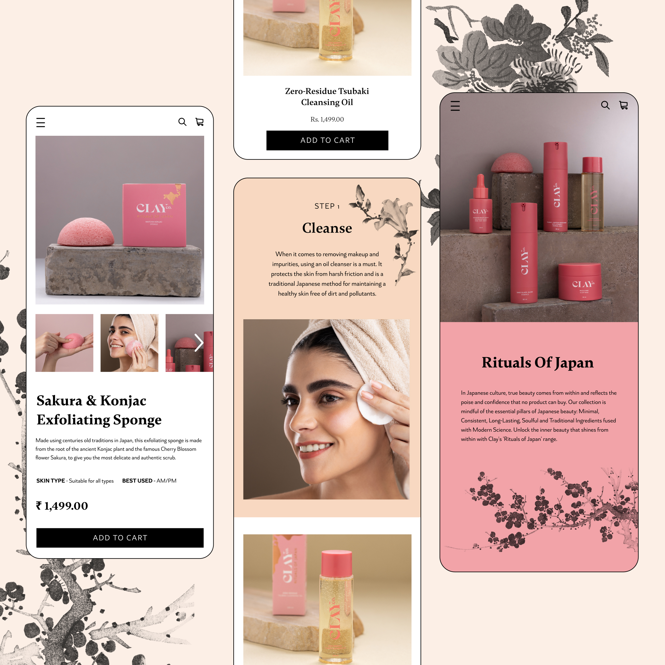
CLAY CO
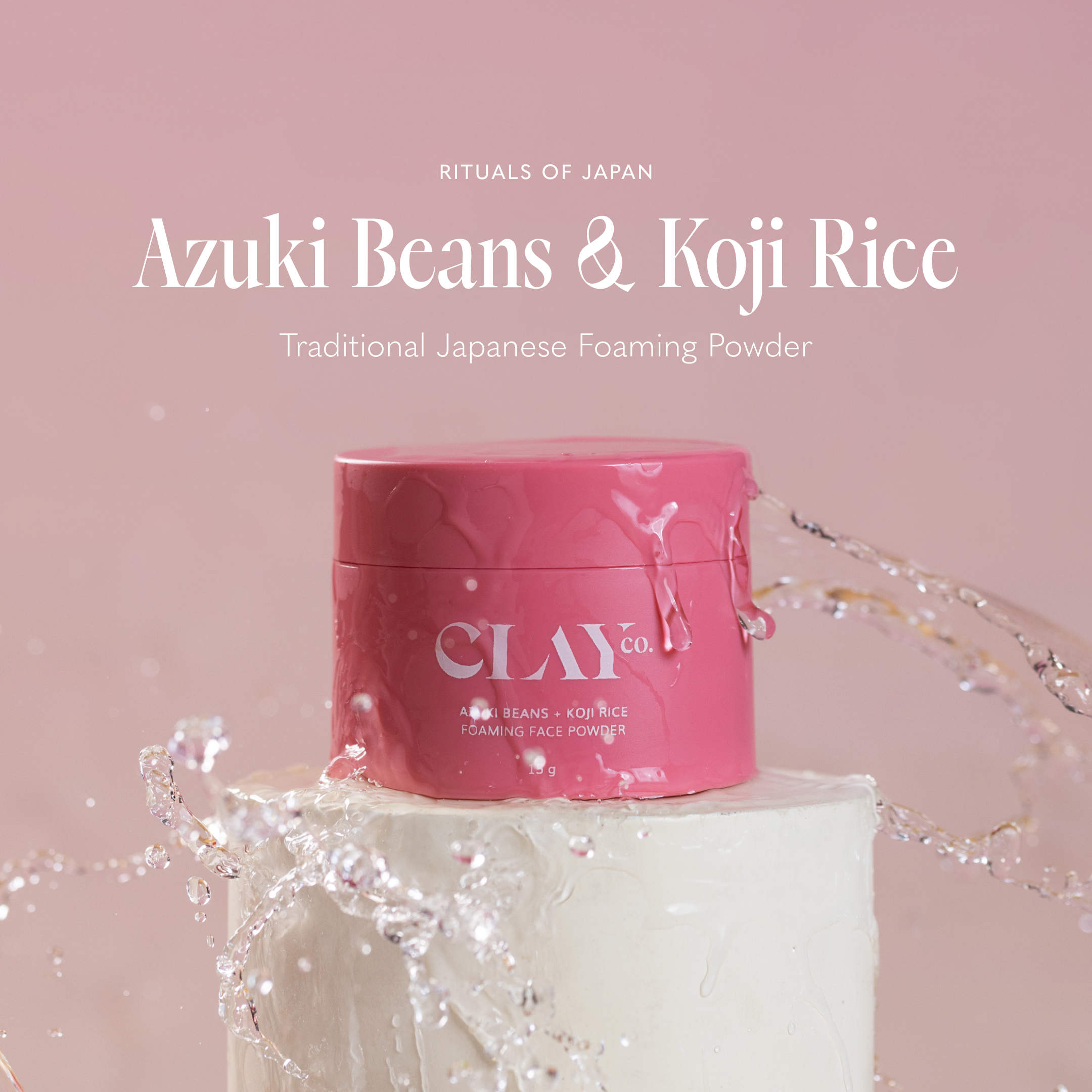
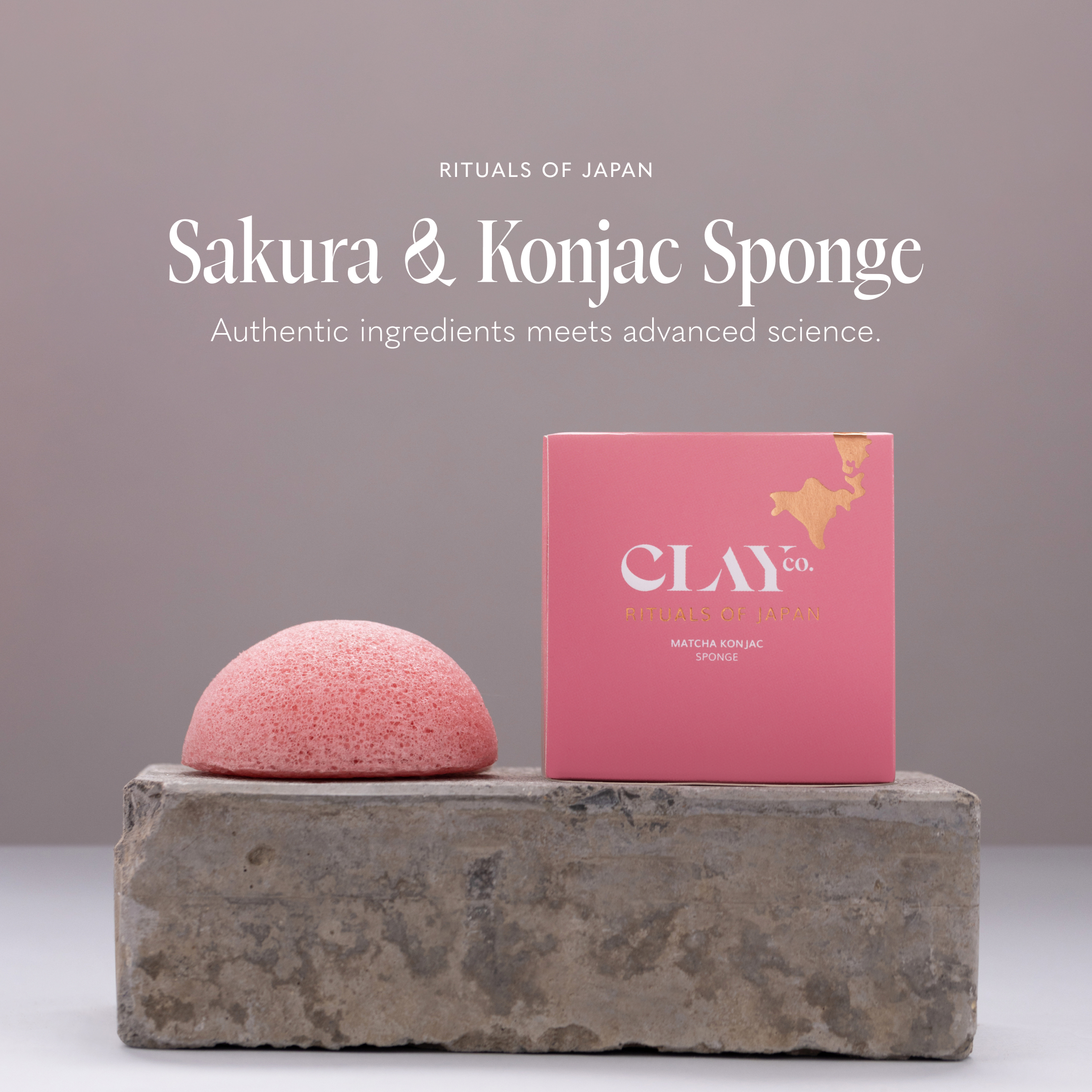
CONTEXT - Clay Co is a skincare brand introducing J-Beauty to India. J-Beauty emphasizes step-wise beauty regimens. The website reinforces the concept of beauty regimens as rituals of self-care. The product page recommends additional products to complete your regimen based on your skin type. Additional colors and elements from Japanese paintings were introduced to Clay Co’s existing branding.
SCOPE - Brand Refresh, Digital Design & Web Design
CLIENT - Clay Co
ROLE - Lead Designer for Weird Communications︎︎︎
SCOPE - Brand Refresh, Digital Design & Web Design
CLIENT - Clay Co
ROLE - Lead Designer for Weird Communications︎︎︎

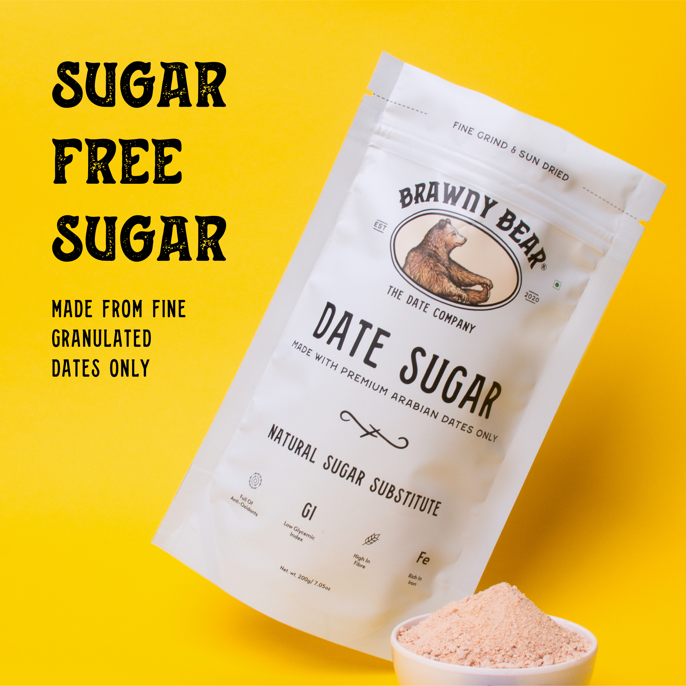
AD CAMPAIGNS
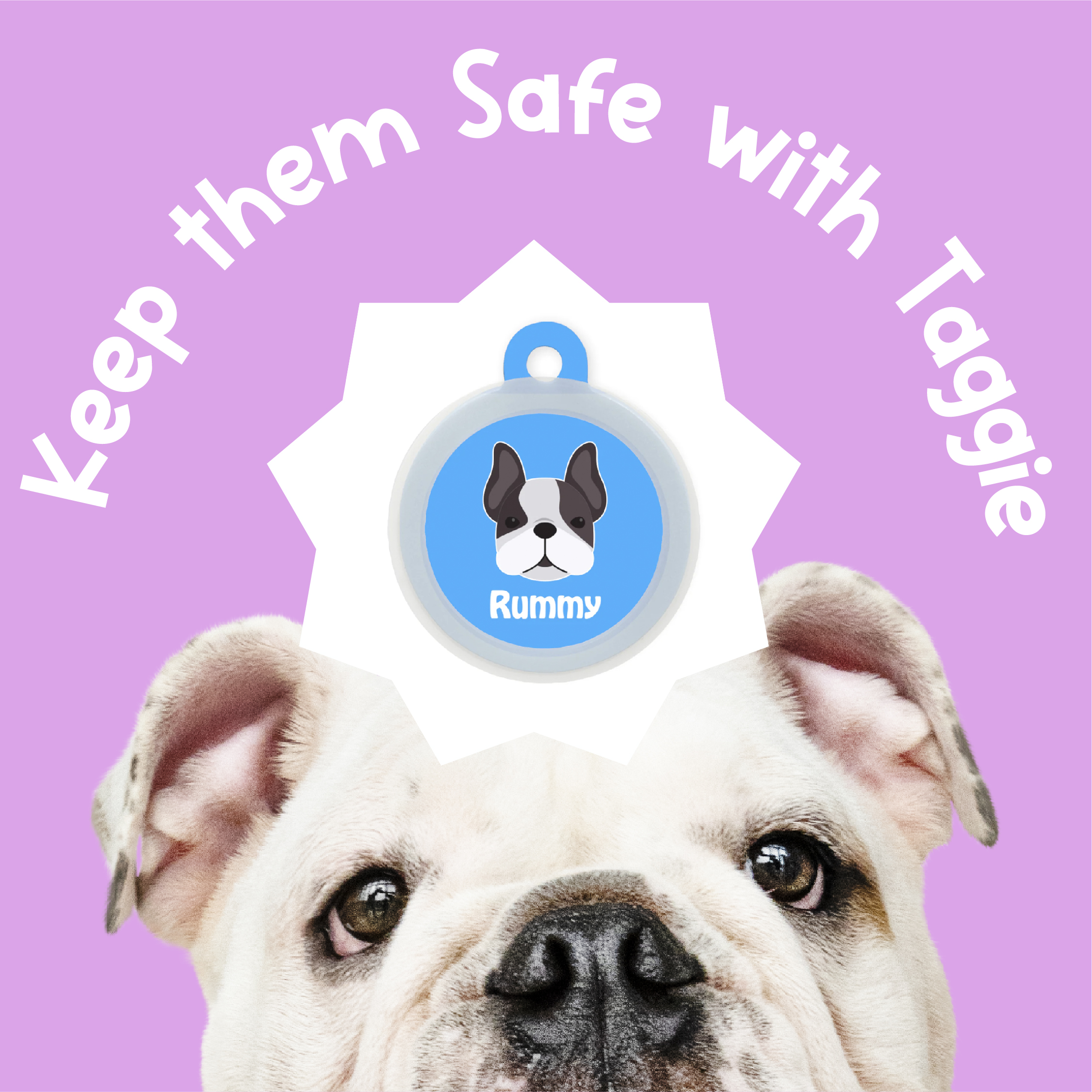
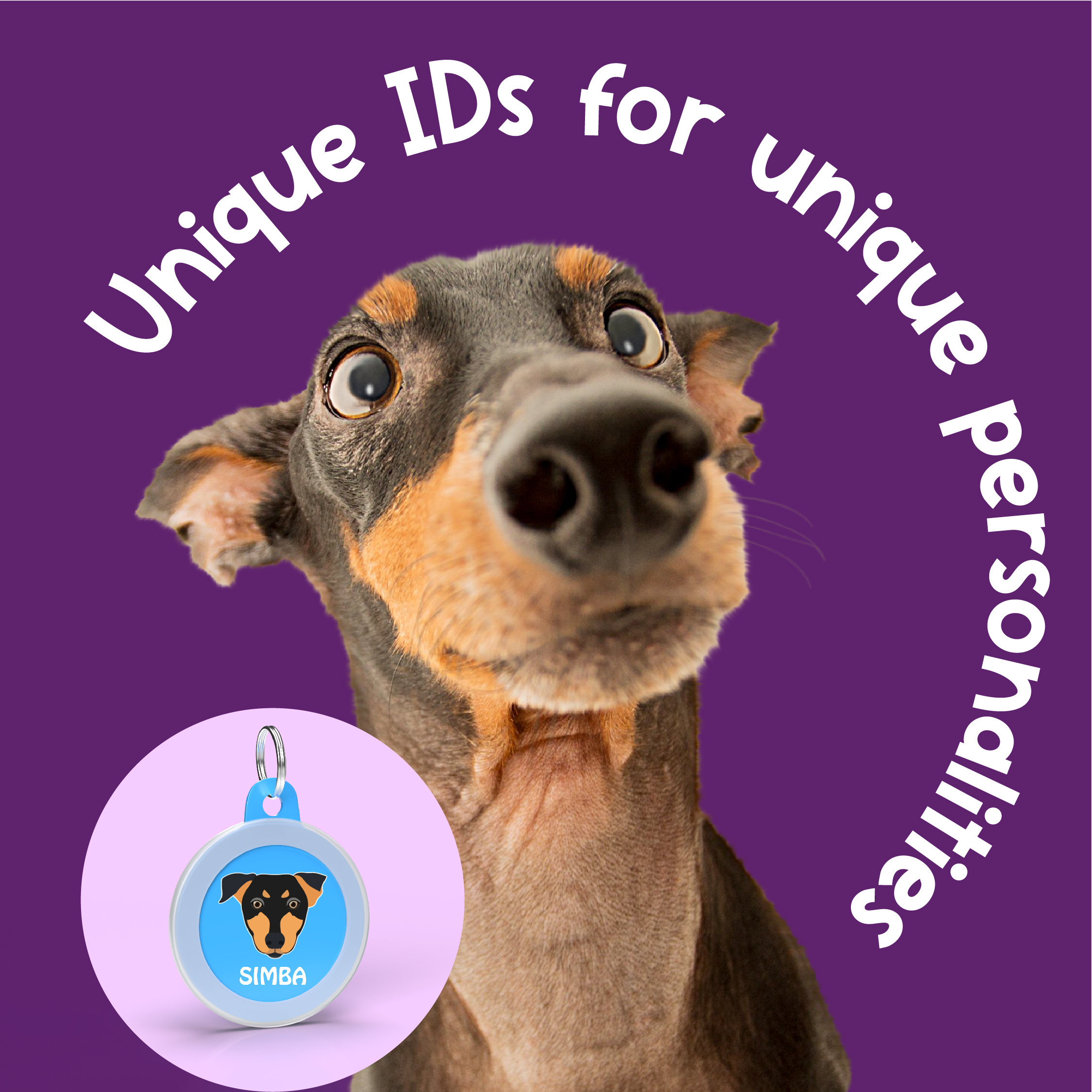
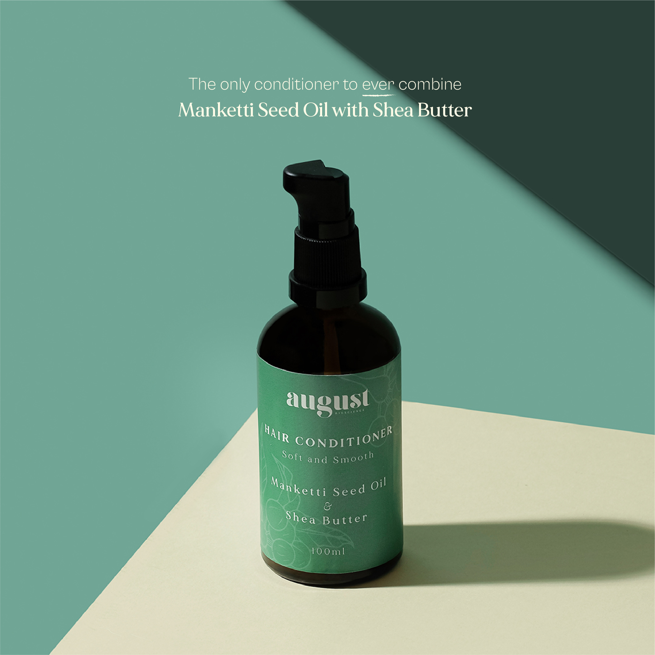
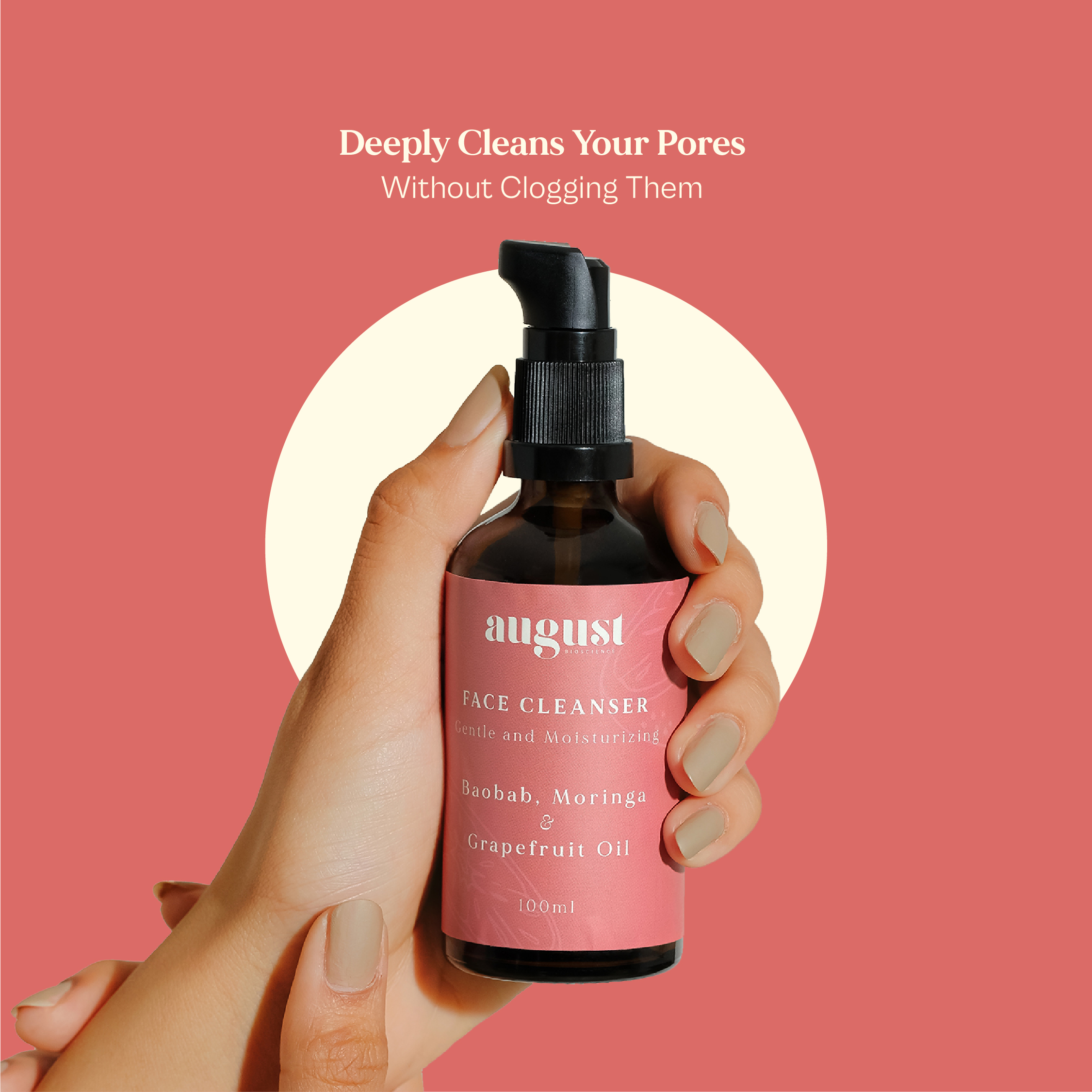
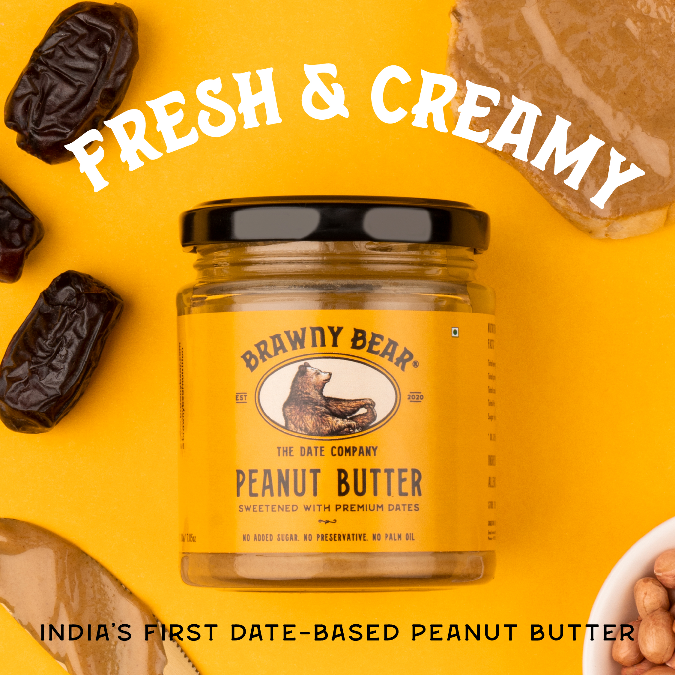
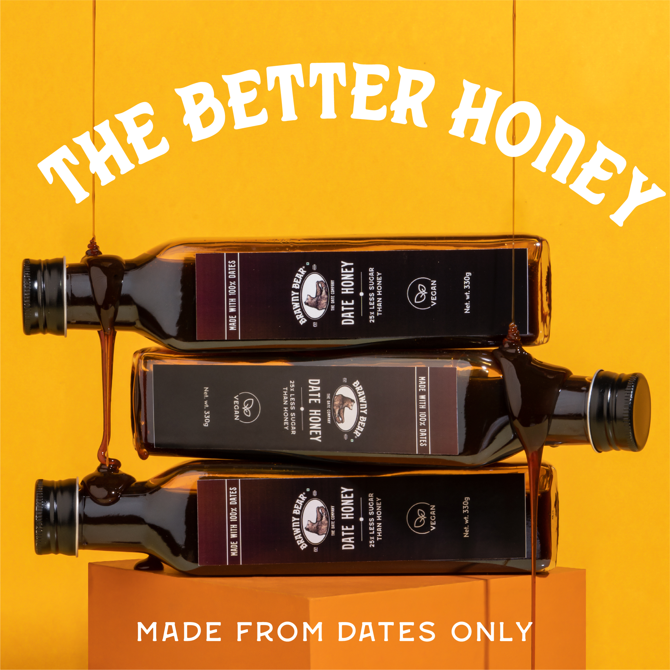
CONTEXT - I worked on Meta ad campaigns for small to mid sized Indian brands like Taggie, Brawny Bear and August Bioscience between 2021 and 2023
SCOPE - Visual Design
ROLE - Lead Designer for Weird Communications︎︎︎
SCOPE - Visual Design
ROLE - Lead Designer for Weird Communications︎︎︎


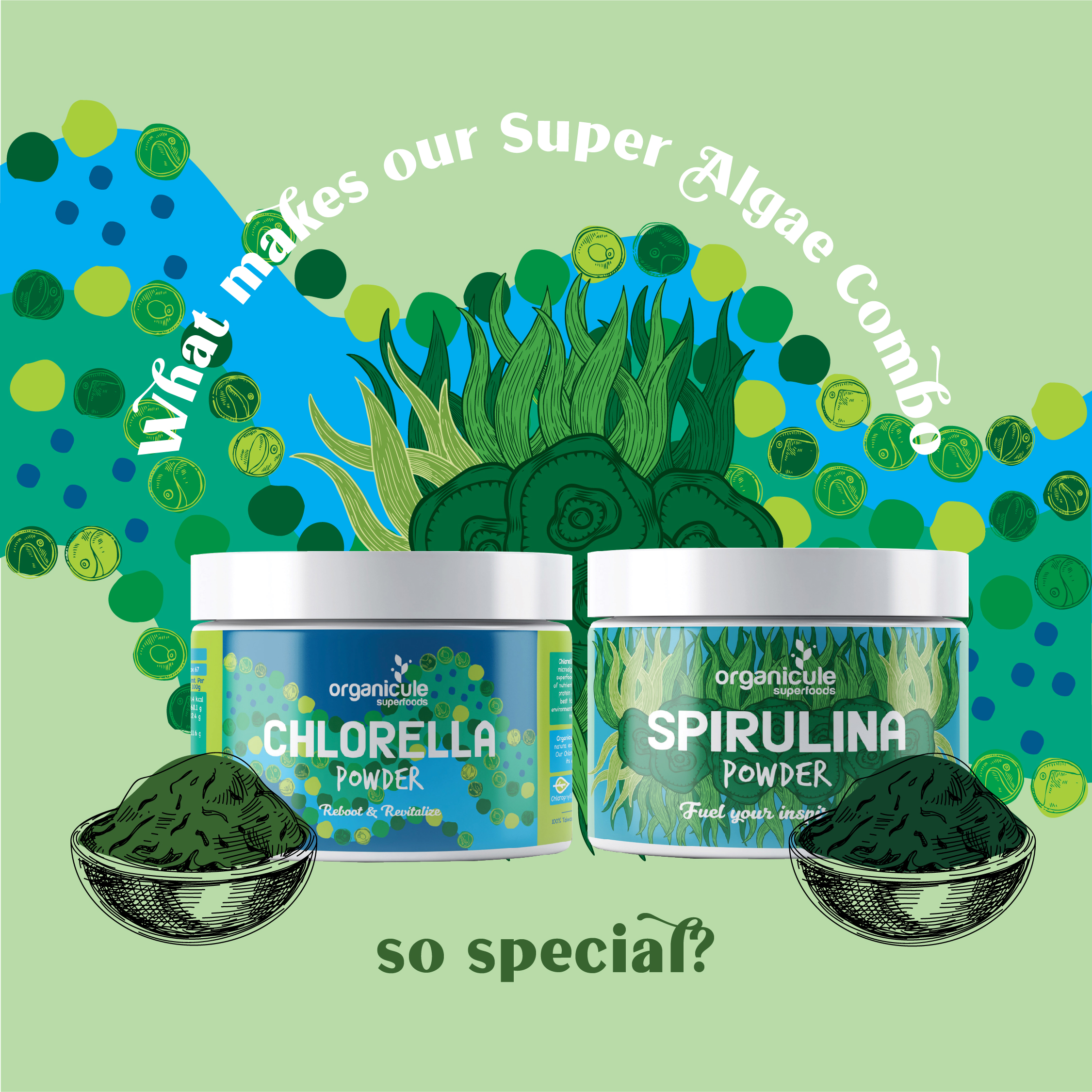
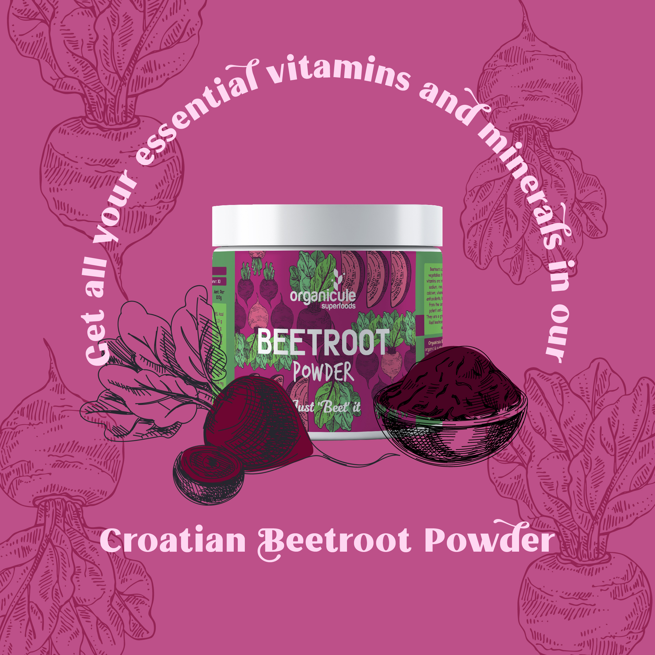
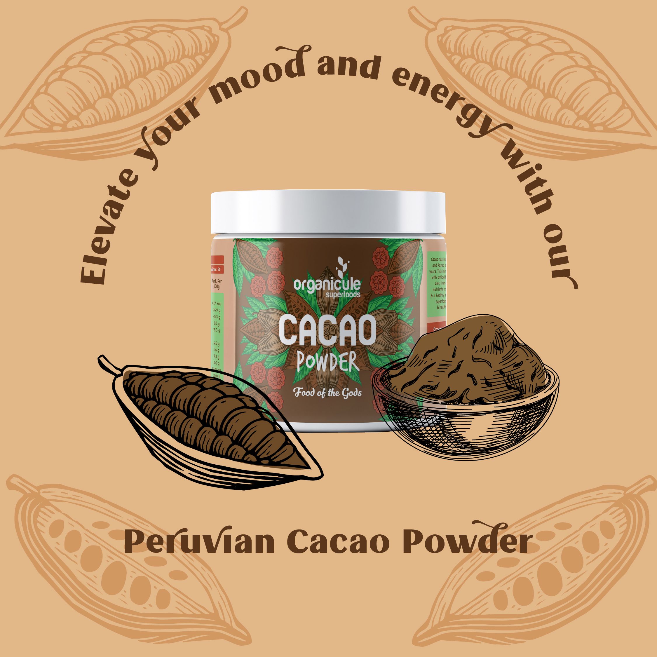
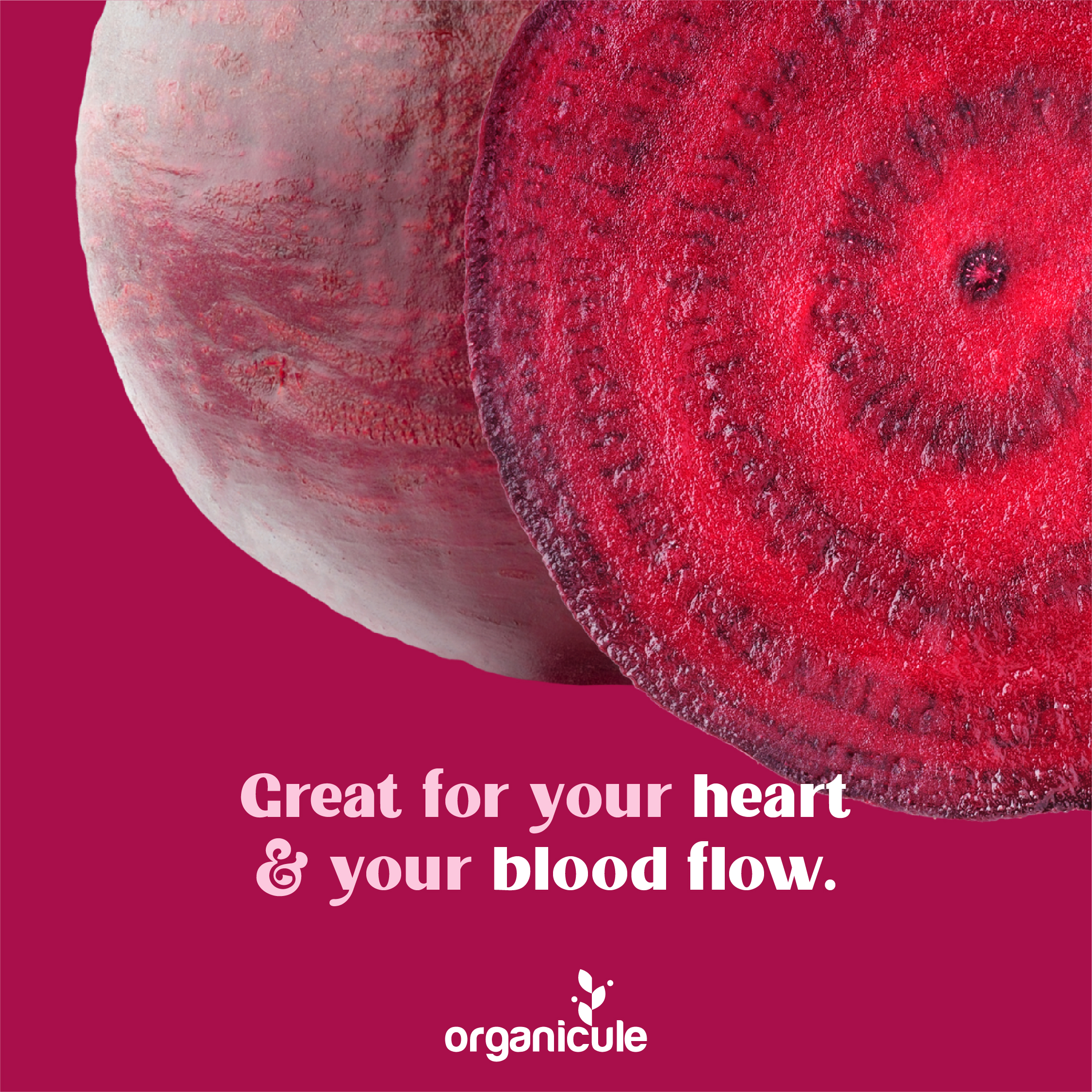
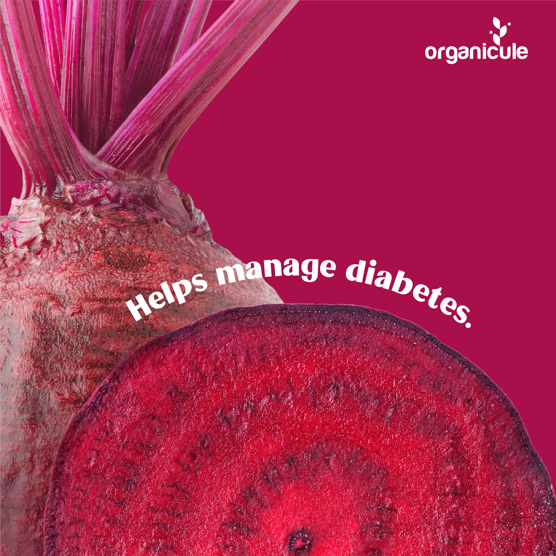
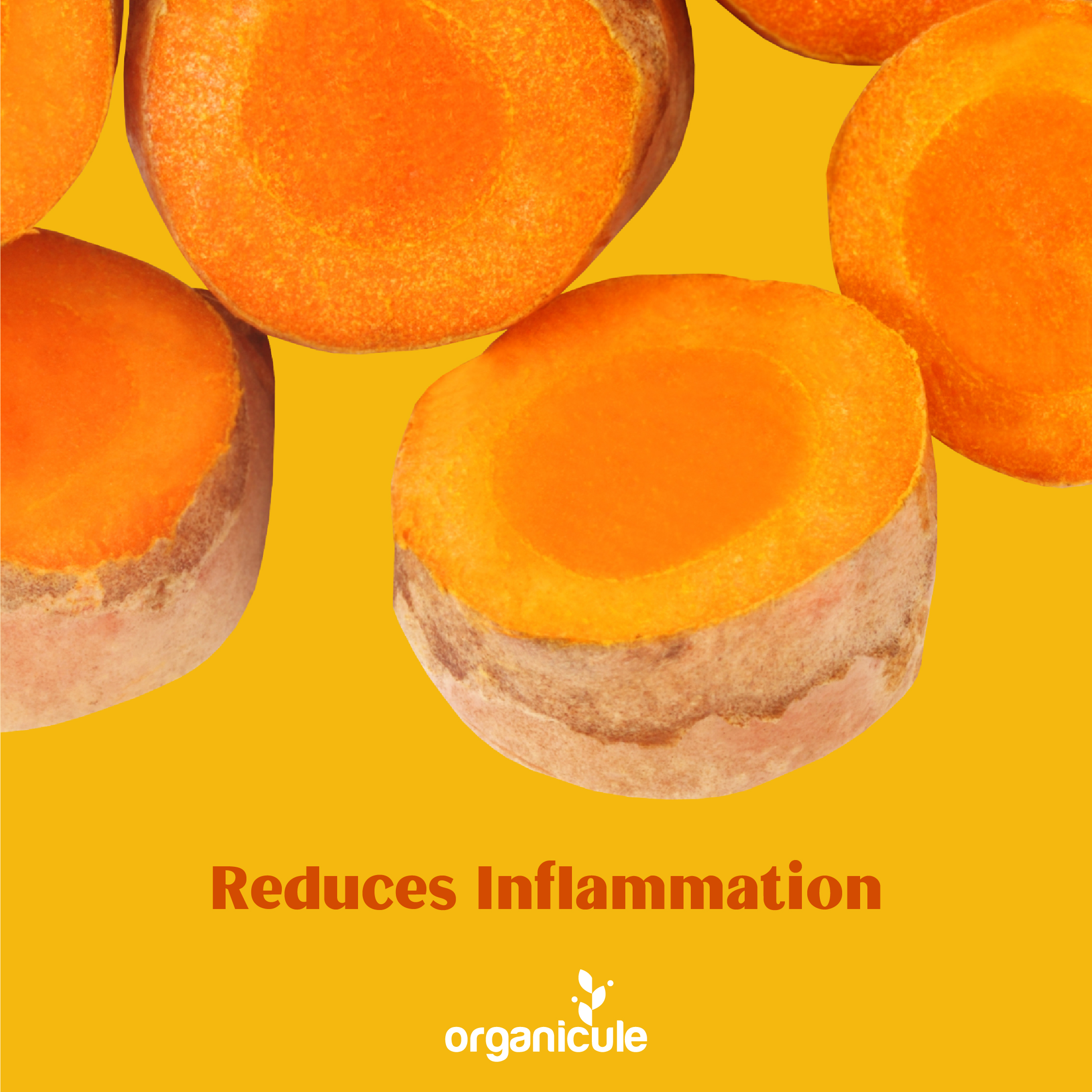
ORGANICULE
CONTEXT - Organicule is a superfood band based in Malaysia.
Phase 1 of this project was creating value based content and marketing material. An illustration forward approach was selected to show customers ways to add Organicule products into their lives.
Phase 2 - Organicule’s engagement and sales benefited hugely from the value based content in the earlier phase. The new round of content focussed more on the product. The visual language is clean and bold, with enlarged images of the ingredients to drive the point across.
SCOPE - Visual Design
CLIENT - Weird Communications︎︎︎, Organicule︎︎︎


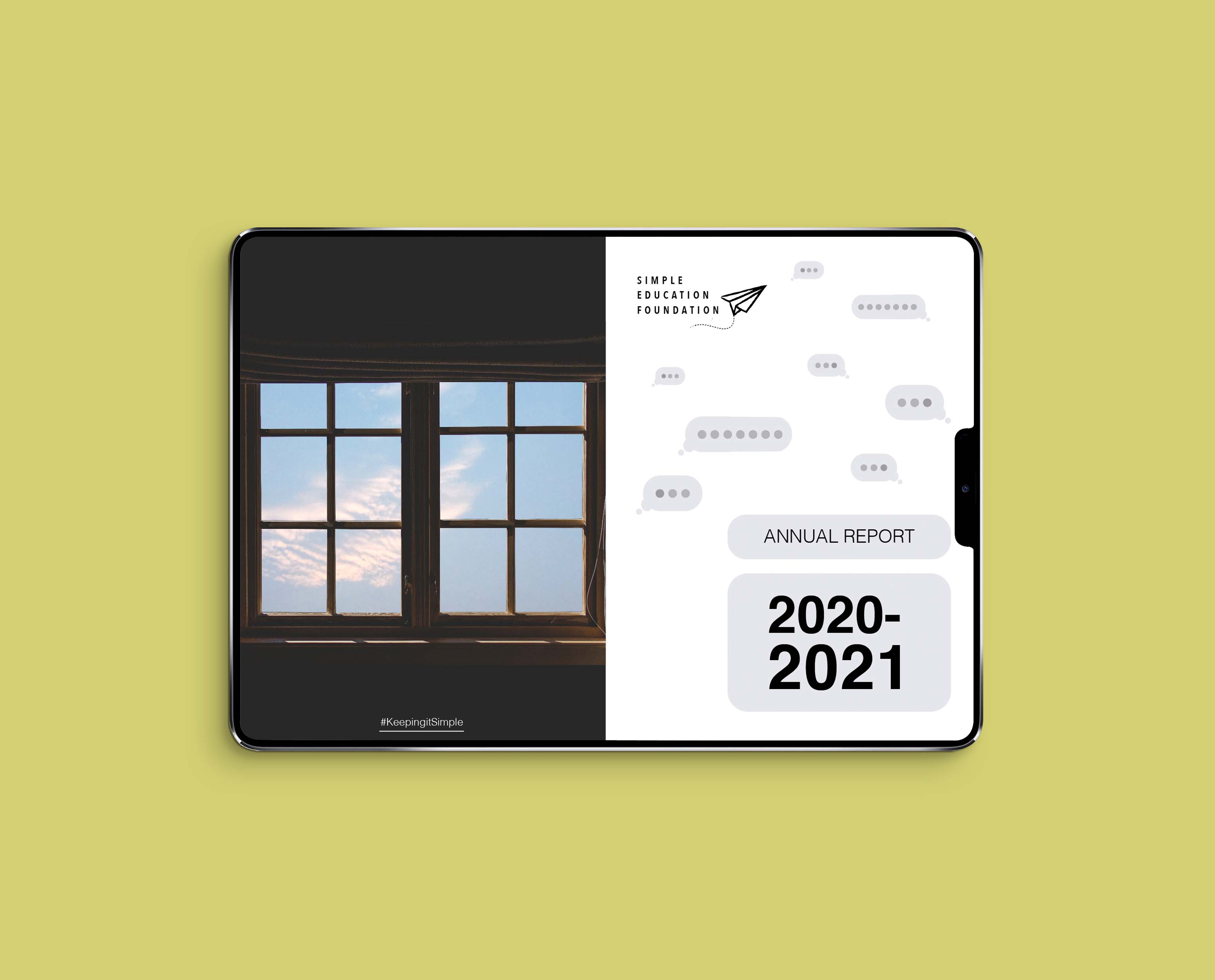
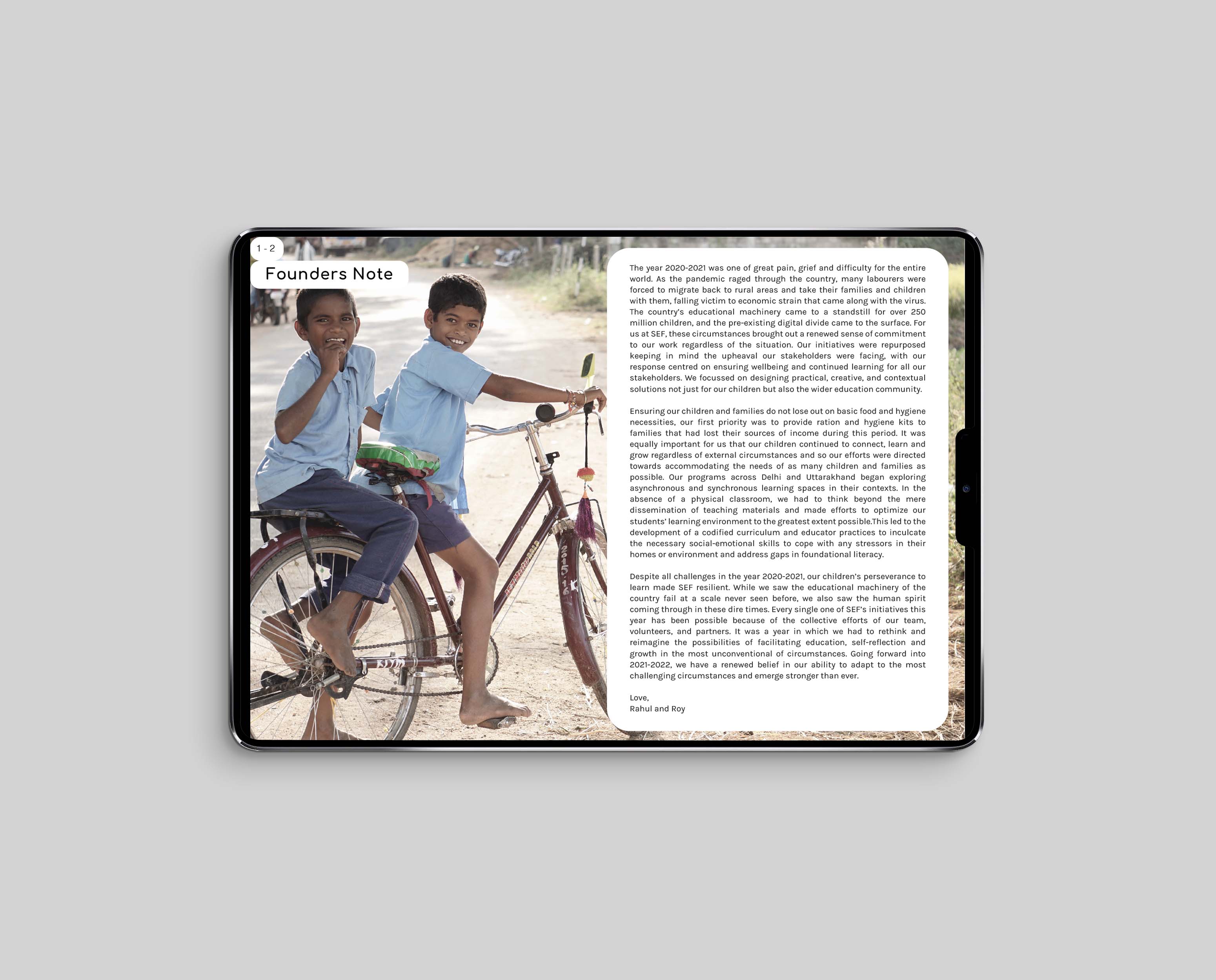
SIMPLE EDUCATION FOUNDATION ANNUAL REPORT 2020-21
CONTEXT - I designed the annual report for 2020-21 for Simple Education Foundation. By 2021, education was almost entirely digital. For people who didn’t have access to tablets and laptops, SEF resourcefully used WhatsApp and other accessible methods of engaging children.
SEF wanted to use the colour scheme of Respond & Repurpose for this report. I used elements that resembled text bubbles in the report to emphasize what learning in 2020-21 looked like.
SCOPE - Visual Design
CLIENT - Simple Education Foundation ︎︎︎, 2021
SEF wanted to use the colour scheme of Respond & Repurpose for this report. I used elements that resembled text bubbles in the report to emphasize what learning in 2020-21 looked like.
SCOPE - Visual Design
CLIENT - Simple Education Foundation ︎︎︎, 2021

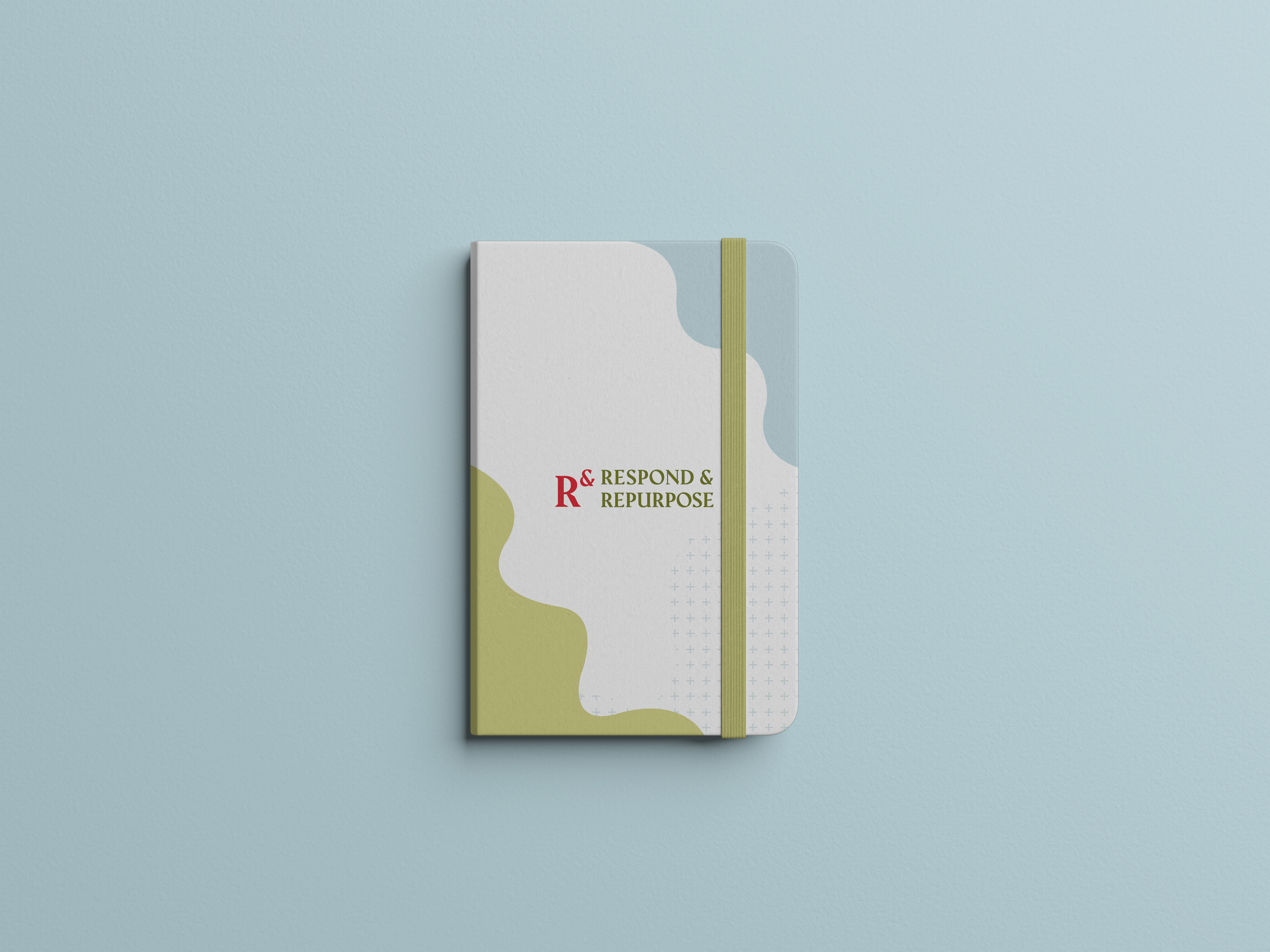
SIMPLE EDUCATION FOUNDATION - RESPOND & REPURPOSE
CONTEXT - Respond & Repurpose is an initiative by Simple Education Foundation to raise funds to support families, children, and educators in Delhi and rural Uttarakhand with food relief, learning, and mental-wellbeing in the face of this global pandemic. Respond & Repurpose has three major aspects - ensuring food, hygiene and support for families, restoring learning during lockdown and ensuring mental well-being for all the stakeholders involved. I designed their visual identity, social media posts, collateral and documents.
SCOPE - Visual Design
CLIENT - Simple Education Foundation ︎︎︎, 2020
SCOPE - Visual Design
CLIENT - Simple Education Foundation ︎︎︎, 2020


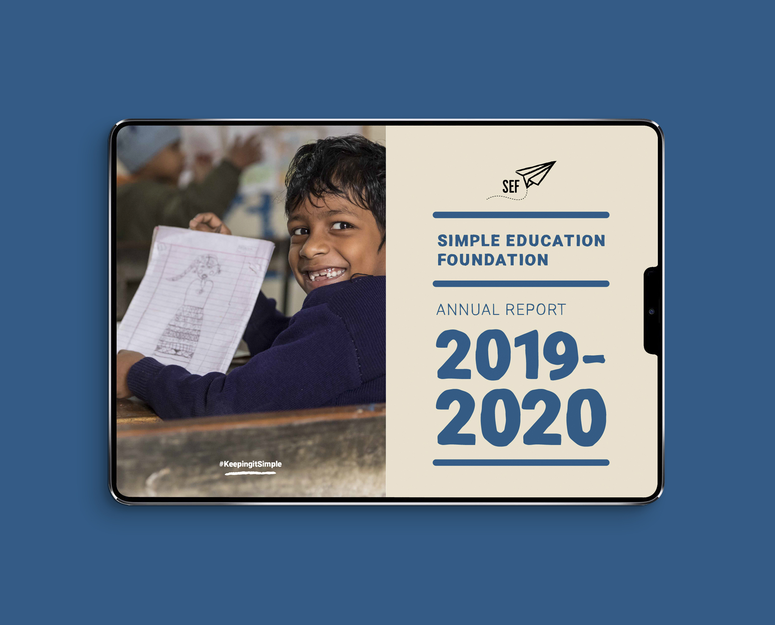
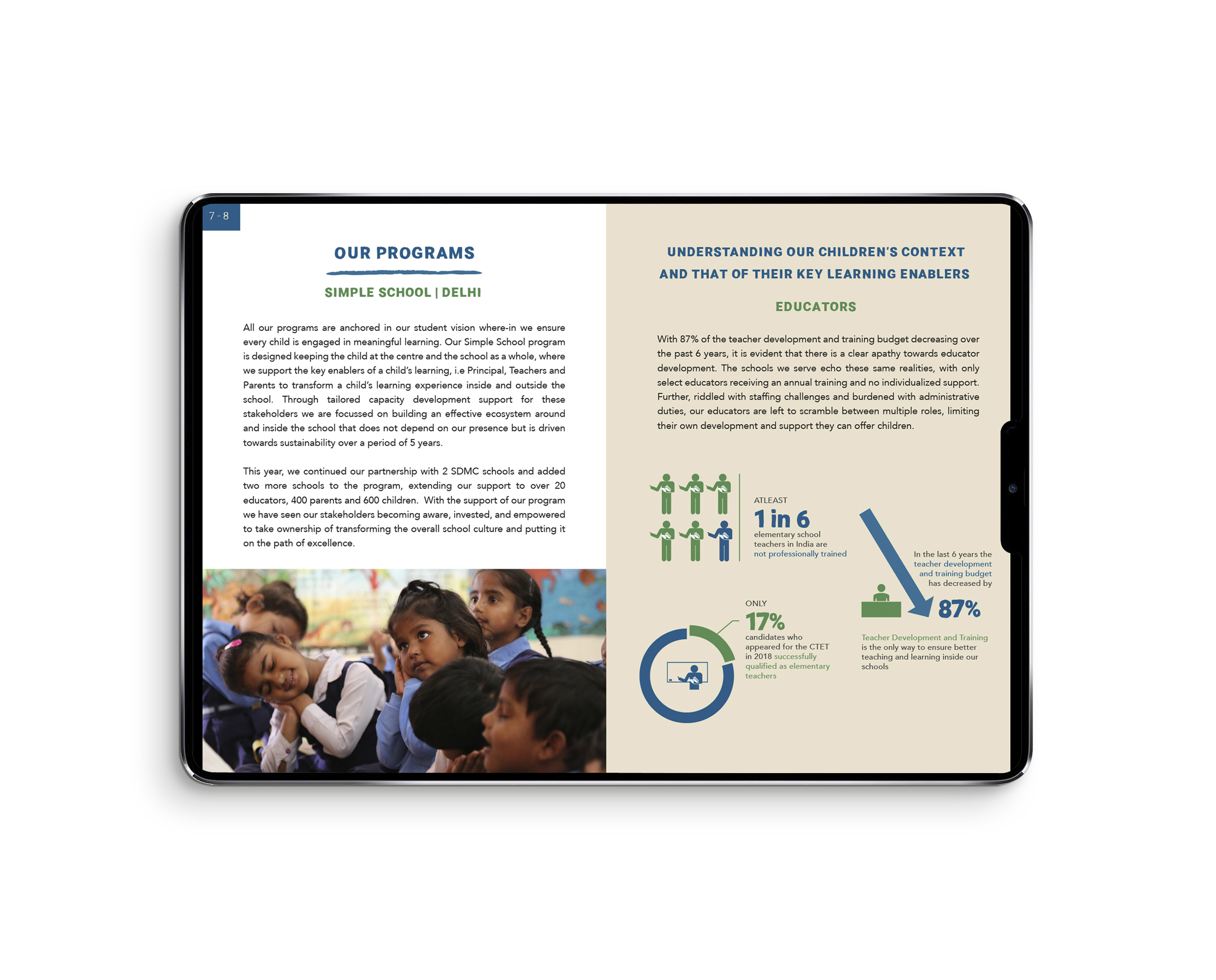
SIMPLE EDUCATION FOUNDATION ANNUAL REPORT 2019-20
CONTEXT - I designed Simple Education Foundation’s annual report for 2019-20. 2020 posed a lot of challenges for the world and for SEF. New ways of learning and teaching had to be created for people without the means to buy multiple devices.
I chose a typeface with rough edges building into the idea of imperfection, iteration and to convey the feeling of something in the process of being built.
SCOPE - Visual Design
CLIENT - Simple Education Foundation ︎︎︎, 2020
I chose a typeface with rough edges building into the idea of imperfection, iteration and to convey the feeling of something in the process of being built.
SCOPE - Visual Design
CLIENT - Simple Education Foundation ︎︎︎, 2020

IKAI ASAI
CONTEXT - I worked with the team at Bhavishyavani Future Co to create a brand video and supporting collaterals for Ikai Asai’s official launch at Maison&Objet Paris 2020, an international home decor trade show. The video summarizes Ikai Asai's four collections which they call ‘Moods’. These moods — Deva, Kama, Lila, and Junoon — are emotions inspired by different aspects of India and what it means to be Indian.
SCOPE - Line Production, Concept, Research
CLIENT - Ikai Asai ︎︎︎, 2019
SCOPE - Line Production, Concept, Research
CLIENT - Ikai Asai ︎︎︎, 2019
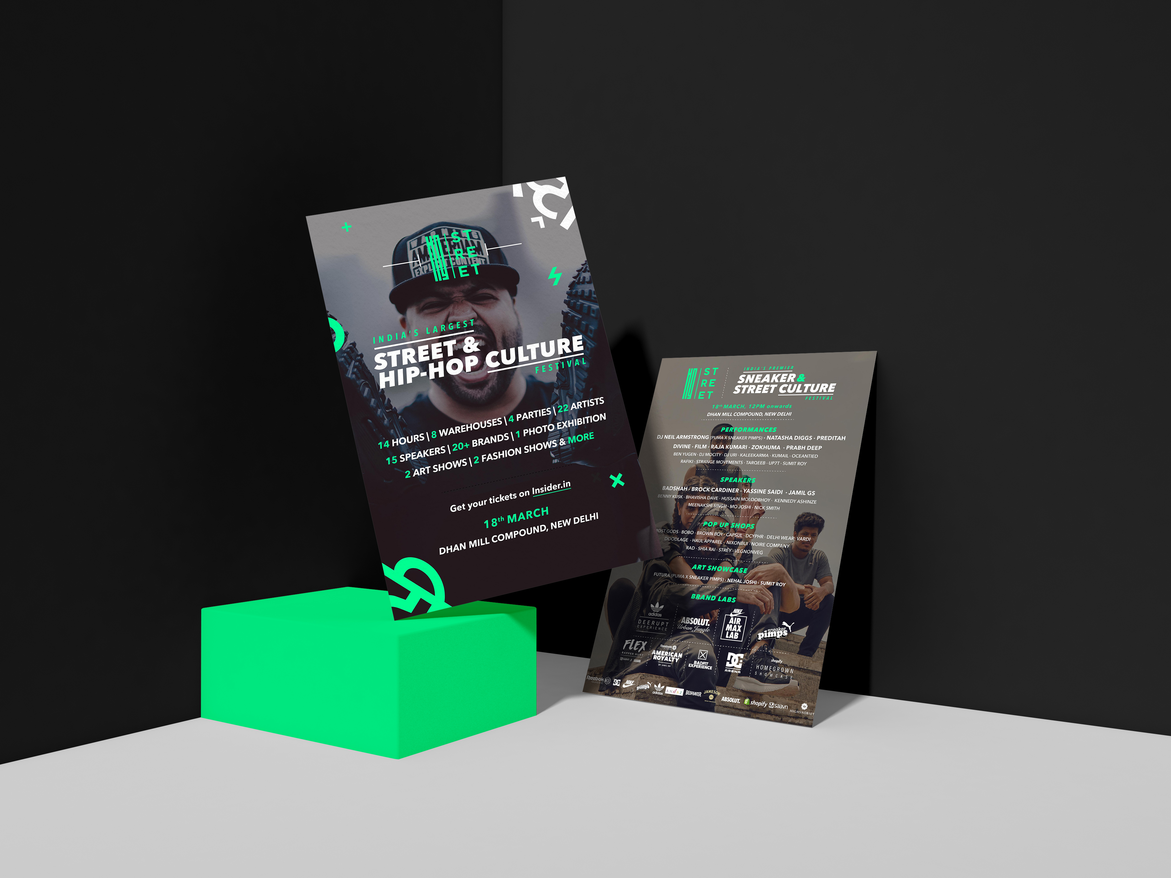
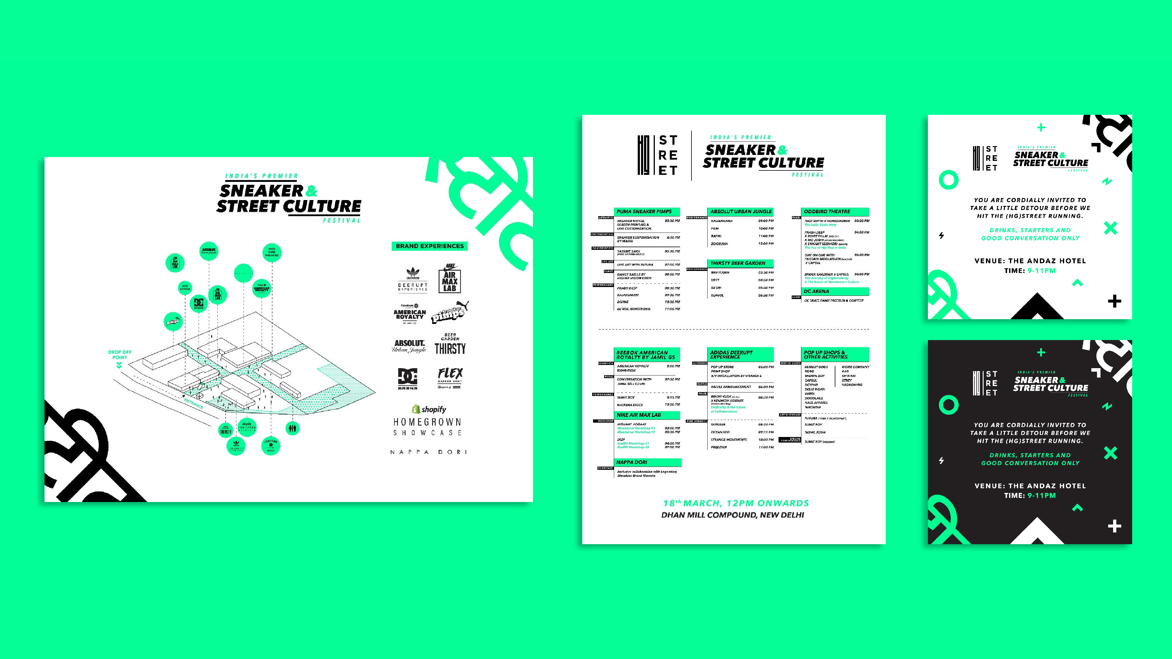
HOMEGROWN STREET
CONTEXT - Homegrown Street was India’s first sneaker and street culture festival. It created a platform for the sneaker, hip hop and street culture enthusiasts in India. The event included talks, gigs and exhibitions. Homegrown Street created a space for lovers of street fashion and burgeoning creators in the arena. I worked with their team on creating their digital content, social media, spatial planning and merchandise.
SCOPE - Identity Design, Spatial Planning, Digital & Print Collateral
CLIENT - Homegrown︎︎︎ , 2018
SCOPE - Identity Design, Spatial Planning, Digital & Print Collateral
CLIENT - Homegrown︎︎︎ , 2018